Usage
Introduction
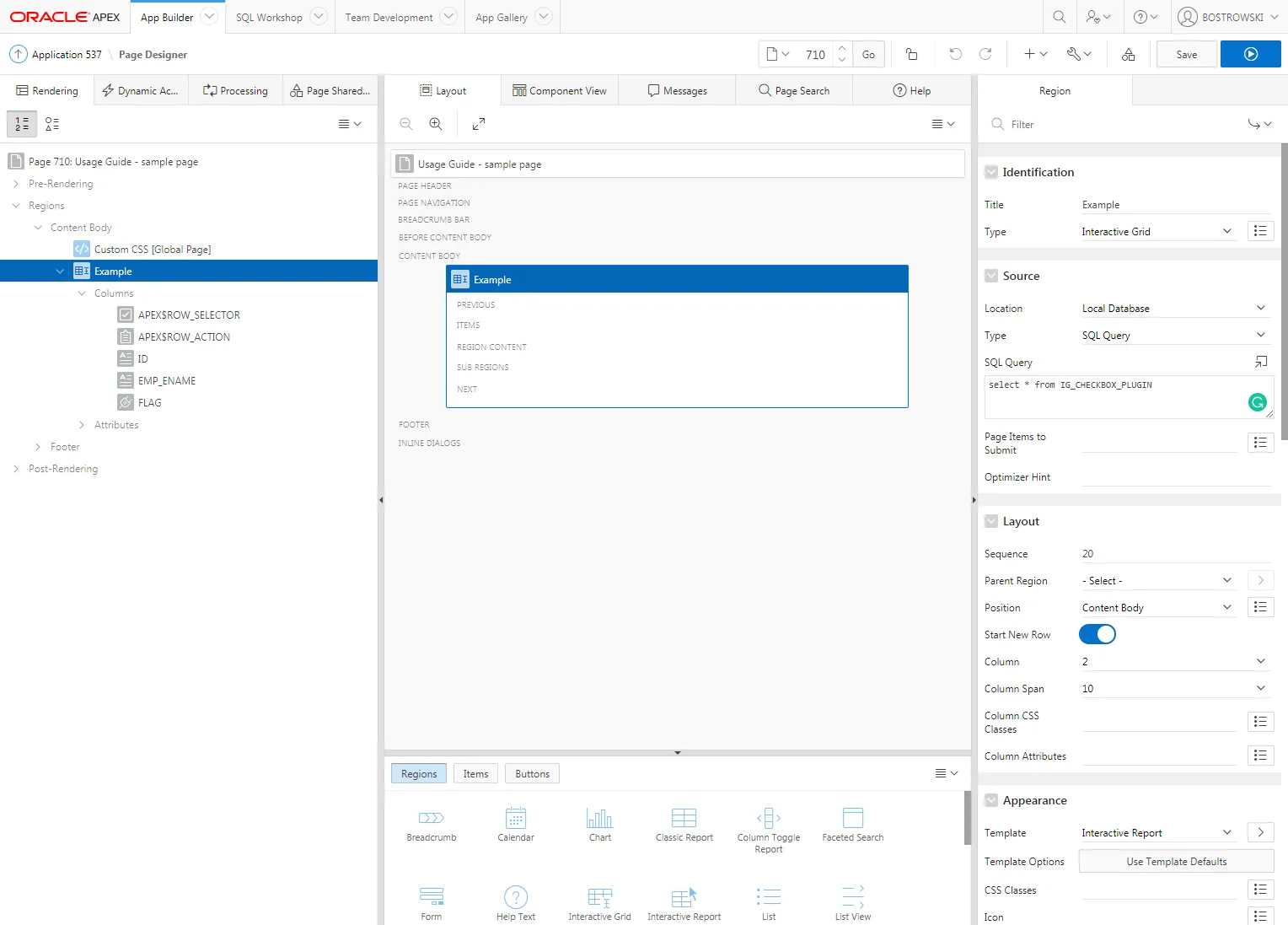
Section titled “Introduction”This usage guide is using the plug-in sample application IG_CHECKBOX_PLUGIN table. In an example application, page 710 is created. On the page, an interactive grid region called Example is created and contains three columns ID, EMP_NAME, and FLAG. The ID and EMP_NAME columns are Display Only and the FLAG column is a Text Field. The interactive grid supports editing and the primary key is set as the ID column.
The FLAG column is a VARCHAR2 column that can store flag values such as:
- Y - when checked
- N - when not checked
- NULL - when the flag is not set
Creating a Plug-in Column
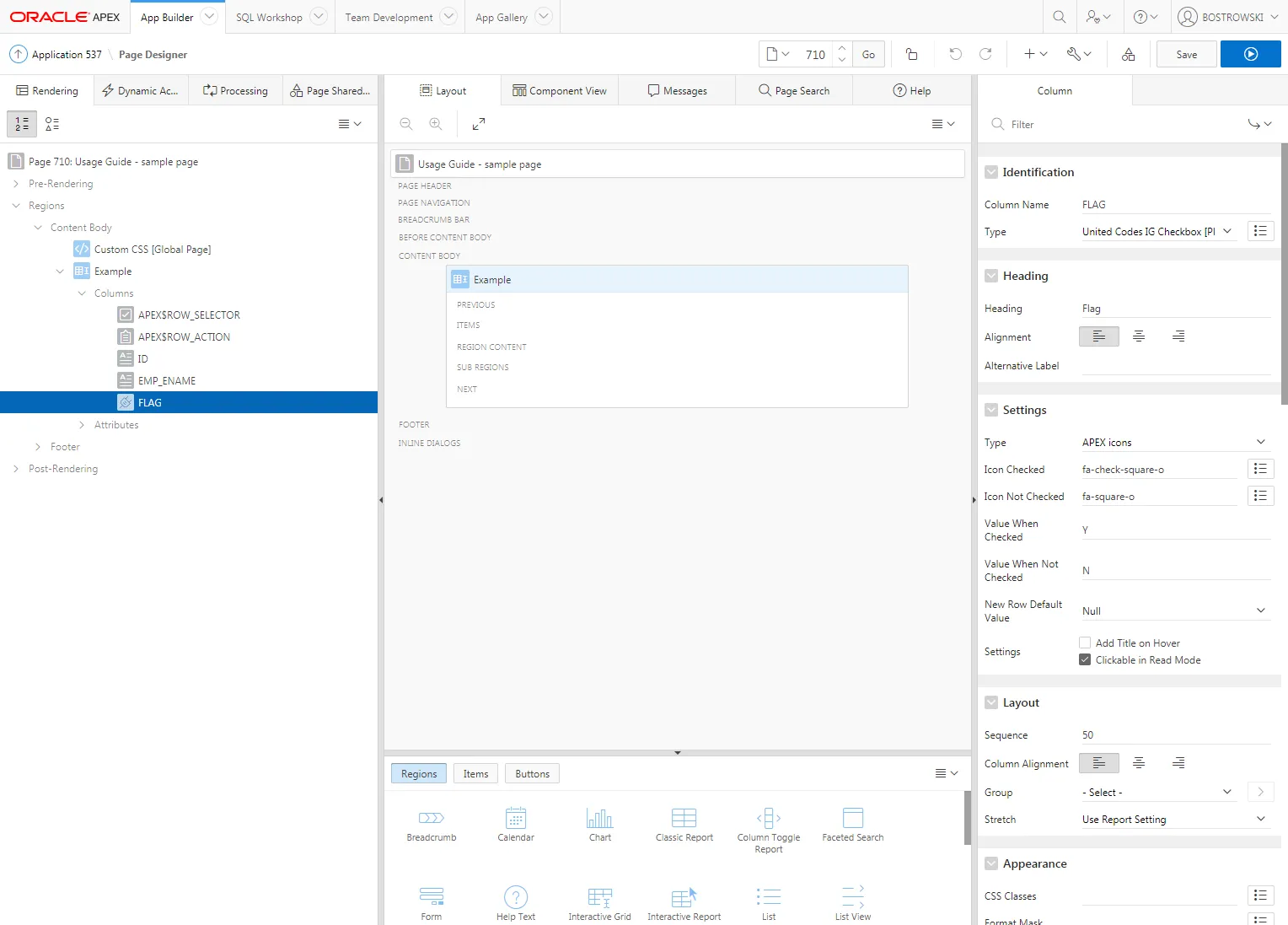
Section titled “Creating a Plug-in Column”- Select the FLAG column
- Set Identification / Type to United Codes IG Checkbox Pro [Plug-in]
- Set Settings / Type to APEX icons
- For Settings / Icon Checked use fa-check-square-o as the default value
- For Settings / Icon Not Checked use the fa-square-o as the default value
- For Settings / Value When Checked use Y as the default value
- For Settings / Value When Not Checked use N as the default value
- For Settings / New Row Default Value use Null as the default value
- (Optional) Set Settings / Settings according to your requirements
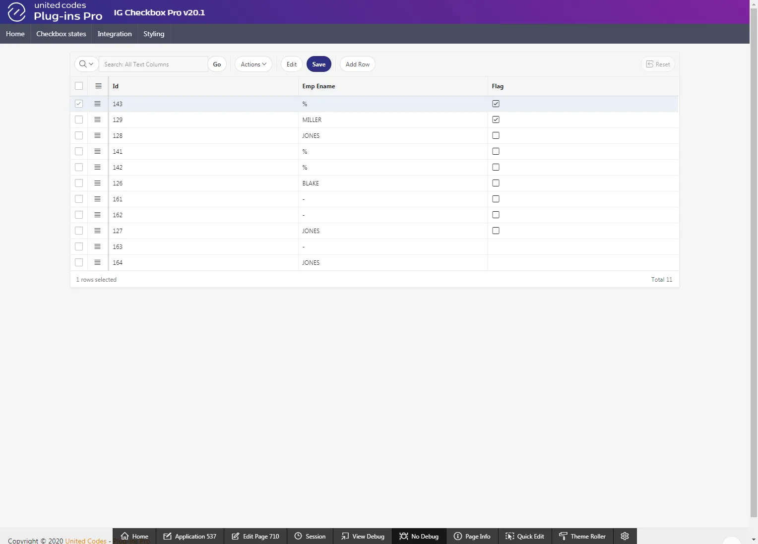
The resulting page will look as follows:
Test the Implementation
Section titled “Test the Implementation”- Open page 710 in a browser
- Test the checkbox inside and outside of interactive grid edit mode (behavior depends on the plug-in Settings / Settings)